
Until last week, I was in a very crowded boat – one chocka with business owners and marketeers using MailChimp for email marketing because they don’t have the energy to move away and learn a new platform.
I am a massive MASSIVE email marketing proponent. Literally nothing beats email in terms of return on investment, and is the reason why a few years ago “Email marketing is the tits” was basically my catchphrase on Instagram.
And yet, we didn’t send a single non-automated marketing email in 2024. Why? Well, bad prioritisation mostly, but also just a total lack of love for the medium.
I think most of us know email marketing is just the best for making sales, but it’s not fun. It’s not fulfilling. It’s not sexy. It’s not ego-rubbing.
And with MailChimp, it’s even less cool. Now this isn’t a MailChimp review, but for more context my primary beefs with MailChimp are that it’s comparatively expensive, and I haven’t rated any of the significant updates and additions to the system in at least 5 years.
It can be clunky and frustrating, and filled with features that I sincerely don’t believe the average micro/small business really needs.
So, what next?
Enter Flodesk, a modern email marketing provider
As a website design co, one of our jobs is to hook up our client websites to whatever email marketing platform they use. And, over the past few years we’ve had more and more clients ask for Flodesk.
Independent publisher 91 Magazine, lifestyle product photographer Weronika Karczewska, and small business podcast Building your Brand – all using Flodesk as their email marketing provider.
Heck, so many clients were asking for it that our own technical director Alex developed our own free plugin to connect Elementor Pro (our technology of choice) to Flodesk.
If you wanna pause here, you can find that lovely free plugin in the WordPress Plugin directory, and read all about how to set it up with an in-depth article from our blog.
As someone who already wanted to leave MailChimp, Flodesk was quickly becoming the obvious alternative, especially because my business bezzie Liz Mosley – host of the Building your Brand podcast – not only convinced me of how great it is, but also passed on her affiliate code for 50% off.
If you’d also like 50% off, here’s the very same link I used – this will give a kickback to Liz and support the podcast.
So I headed straight to Flodesk to start the switch. And what I mean by that is I dawdled for at least 4 months, and then set it up this week.
Just before I made the switch, I wanted to send one last MailChimp email with the primary reason of clearing out our database of subscribers so that:
- I didn’t have to transfer personal data from people didn’t even wanna hear from us
- I could push unsubscribes whilst still on MailChimp, which should protect our reputation a little on the new platform
PS. Wanna know more about sender reputations? I have a blog post about that too.
I also posted about it on Instagram, where a few people asked for a review of Flodesk, and that’s how we got to right here, right now.
View this post on Instagram
Pros: the Flodesk features worthy of an uppened thumb
1. Very stylish email templates
So aesthetic.
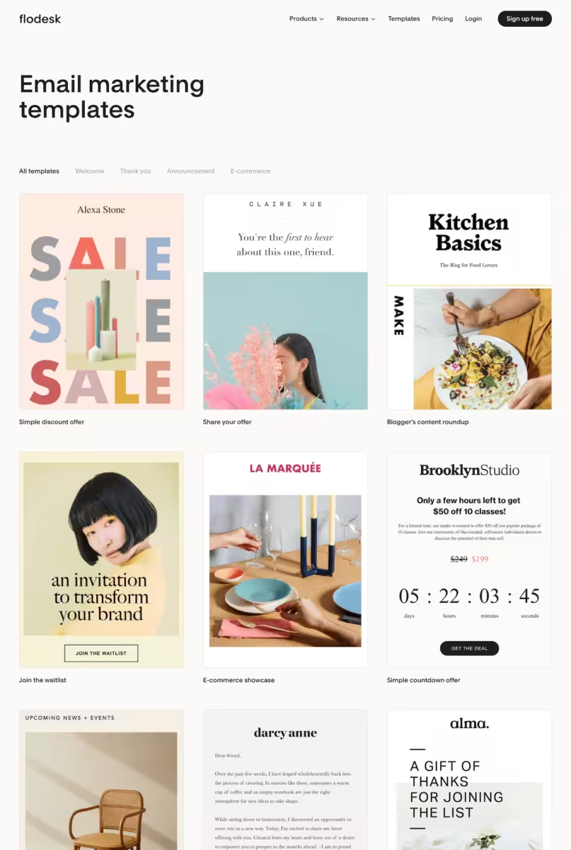
There’s absolutely no denying that Flodesk is ruddy nailing their library of pre-made templates and layouts. I’m actually not sure I’ve ever encountered a platform helps its users to create designs that just look so ruddy good.
Flodesk really is bringing sexy back to email marketing.
Well, I’m not sure email was actually ever sexy.
I try not too focus too much on visual appearance when judging business tools and templates. I cannot count the number of business owners and marketing managers, including myself, who have purchased a very attractive website or graphic template, only to end up with a scrappy disappointment after making essential customisations.
It’s one of the reasons that a more modern catchphase of mine is “Do you really like that website design, or is it actually the branding and photography?”.
Literally every layout I grabbed and popped in our brand fonts and colours looked polished and ready-to-send. But, to put a small caveat on my first pro-Flodesk point – we do have a pretty refined brand identity and a bank of stunning photography (from the very talented Georgia de Lotz) so I wouldn’t expect the same results for a business that isn’t aesthetically winging it.
2. Simplified, clean, & sleek user interface
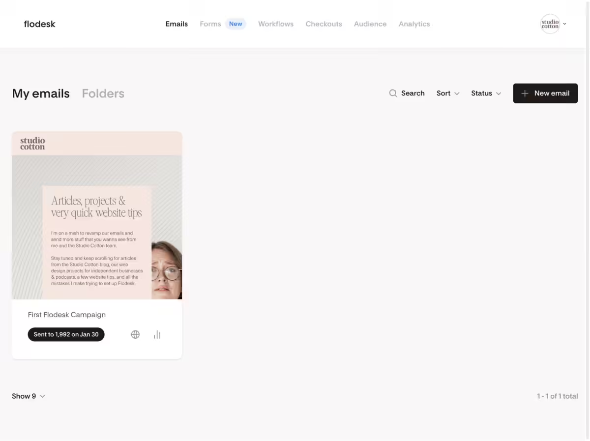
Flodesk is the Mac to MailChimp’s PC. It’s light and breathable, but most importantly – it isn’t even slightly intimidating.
As someone who thinks email marketing is the tits, I want as many small businesses as possible to benefit from its impressive potential for revenue generation. However, when chatting about email marketing platforms with my peers, I’d often hear comments like “Oh I’d love to but I couldn’t work out where to start” and “I signed up but it was all too complicated”.
Like a Mac, Flodesk’s simplified user interface (UI) supports its new and non-technical users by showing as little as possible on any one screen at any one time. This greatly helps focus attention and learning time on the settings needed to get that first email campaign designed and dispatched.
3. Way faster to create a very nice single email campaign
I popped together our first email campaign using Flodesk in about 2 hours, and that included choosing most of the content, copywriting, testing and scheduling. Oh, and learning a new platform that I’d literally never used before.
The bank of templates and layouts made it feel like I was starting the email creation procession about 25% ahead of the starting line. By far, the biggest, most-enthusiastic thumbs up I can give Flodesk is that it really does make it quick and easy to design a beautiful email.
I think this might be a favourite benefit of any designers who have previously been left frustrated by the limitations of email technology, and anyone who, like me, used to spend way too long shoving in-line CSS into MailChimp. I feel free. Free dangit.
4. Saving and applying global brand styles
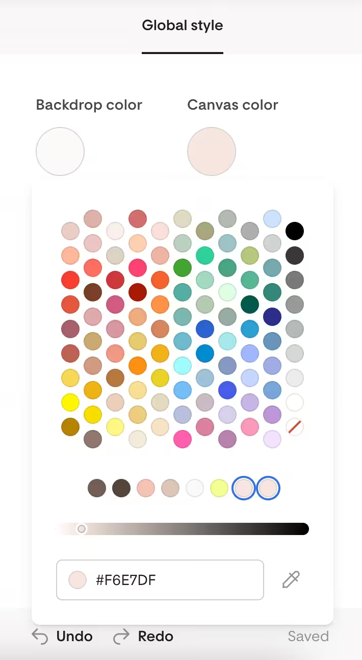
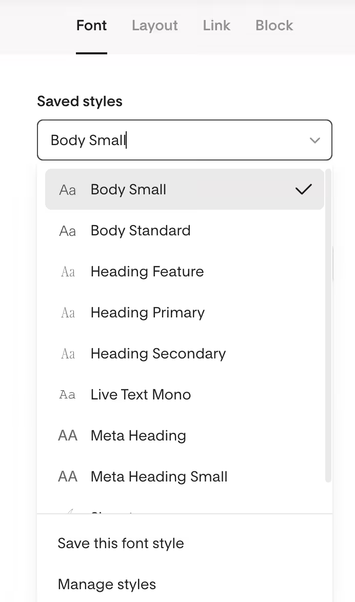
Ya know what is a pain in the bum? Copying and pasting the same hex code in 15 different places, and selecting Perfectly Nineties, size 42px, letter-spacing -3px, weight 100 and 13 more.
Allowing a user to set up global brand styles is not a unique feature – I think MailChimp has had some version of global font styles for at least 10 years – but Flodesk have just executed it in a way that again feels much simpler and intuitive.
I did incur a small bug which made it trickier to name my global font and buttons styles (which I definitely would recommend doing), but I’m going to give Flodesk a pass here as even with the bug, it only took one extra click to set these up all neat and tidily.
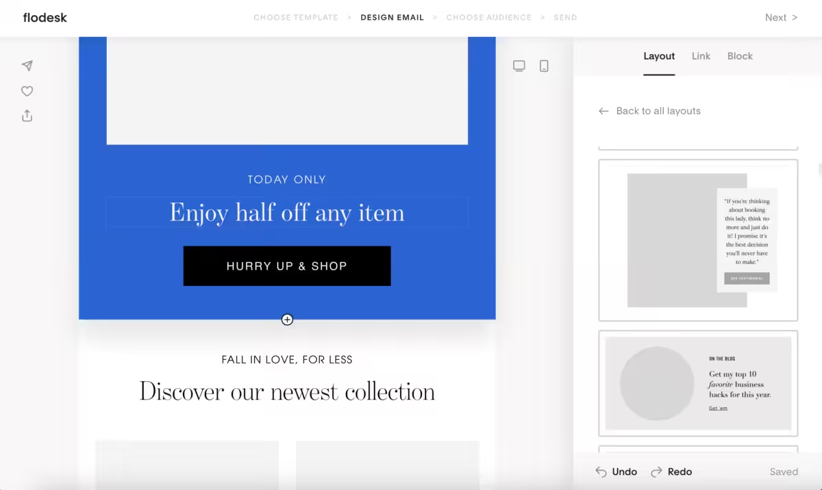
5. Custom fonts with a clever lil workaround
I’ve worked in email marketing in some capacity since around 2007, and for pretty much that entire time, one of the biggest design drawbacks of email is that custom fonts just didn’t render consistently.
Like if you wanted to guarantee that every single person who received your email would see the exact same design, you’d have to pick Verdana or Georgia or Courier New. Ok, you got me – I’m exaggerating – you actually had a whole 8 options. Maybe expanding to 26 if more web browsers were playing ball.
In reality, a lot of brands would instead send their text within an image file (not amazing for accessibility) OR just let people who use Outlook suffer with an ugly, fancy-fontless email.
However, Flodesk does allow for custom fonts within it’s Layout building blocks. Now I’m not exactly sure how Flodesk get these fonts to work so consistently, but there must be some tricksiness going on, as custom fonts do not work in their non-layout blocks.
I didn’t find this too much of an issue though, and stuck to using the much more aesthetic layouts throughout our email campaign.
6. Beautifully mobile-responsive emails
To re-iterate, I am a bit old and I’ve been working with emails forever. I’ve been working with websites even longer, including in the days before they were useable on a mobile. Heck, I probably started working in digital marketing before mobiles even had internet browsers.
These days it’d be ruddy silly, SILLY, for a website to not be mobile-responsive. Responsivifying (sure, that’s a real word) a website can be one of my favourite tasks when designing for our clients; optimising and folding designs, swapping in and swapping out elements, even changing rectangles into circles if I’m feeling fancy.
All of this takes code – particularly a lot of CSS – which web browsers render as lovely websites. However, email platforms like Outlook or Mac Mail or Thunderbird can’t render this code, which means we can’t use it in emails.
This was a very very very long way of saying that when it comes to optimising an email campaign for viewing on a mobile, there’s genuinely not much that can be done.
And here’s where Flodesk is yet again a clever sausage. By pushing you towards its decent library of template layouts, it can pre-optimise them for mobile, meaning you don’t really have to think about that view at all.
I can’t remember ever sending a MailChimp campaign without making a few tweaks for mobile – but I literally made zero on Flodesk.
7. Audience tagging on button and link clicks
I would love to send emails to my Bristolian and Bristol-adjacent subscribers to invite them to my IRL events. Actually, I guess what I really mean is that I don’t want my Scottish, Dutch and Canadian subscribers to leave me because I keep bangin’ on about a talk they can never attend.
However, having started building our mailing list in 2018ish, I’ve never actually collected this info, and hadn’t quite figured out how to set this up in MailChimp without a tickle of bodging.
But, with Flodesk’s feature that allows you to make a button-click add a tag to a user, it’ll be a right doddle. In some future campaigns, I’m basically gonna create a button that says “Tell me about Bristolian stuff”, and when it’s clicked, each user will be tagged. Then, when I wanna shout about a panel, workshop, or meetup – I’ll just email those Bristol-tagged users.
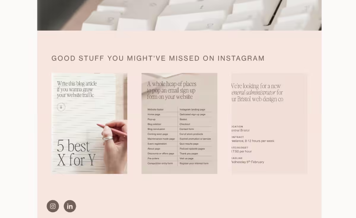
8. The Instagram block
Is this block gonna change the world of email and/or make you loads of sales? Almost certainly not.
Is it a fun addition that can help create awareness of another brand touchpoint? Yep.
Flodesk has a cute email building block that allows you to pull some of your recent Instagram posts into your email, and whilst I’m generally not the biggest fan of Instagram feeds (you can read more about it here: 6 sensible alternatives to including an Instagram feed on your small business website) it’s a cute semi-gimmick that allows for for some easy visual additions to an email campaign.
9. Importing our MailChimp subscriber database
Full transparency – I wasn’t the person who imported our email subscriber database, that was delegated to our wonderful technical director, Alex.
Not because the job was technical – but just because he’s also my husband and if he asks if there’s anything he can do to help me out, I’m gonna give him some boring admin.
When I mentioned that I was writing this review, Alex wanted me to drop in that he really appreciated how Flodesk allows you to import subscribers using the file formats of seemingly all other major email marketing platforms.
Now he did add a caveat that the documentation wasn’t the clearest here, but I’ll be honest – I tuned out a little at that point. Sorry Alex.
10. Non-email features that are kinda useful
If you want an email marketing platform that doesn’t just send emails, boy are you in luck. Most email platforms will do other stuff too – and it’s actually another reason why MailChimp was grating on me.
It always felt like they were announcing new products and features – but their email marketing solution remained relatively unevolved and cumbersome.
Flodesk has just a handful of non-email products; forms (for signing up to emails), a link in bio tool, and their biggie – checkouts.
Flodesk Forms
A very mild thumbs up from me. Flodesk Forms allows you to create a form that signs people up to your mailing list, which you can link from, say, a LinkedIn post, or you can embed into your website.
As a website design professional, I would advise against using an embedded form IF you are able to hook up a native form (one provided by your website platform) to Flodesk. It saves a lot of custom-code niggles, style inconsistency, and responsivifying – and that’s exactly why we built our free Flodesk plugin for Elementor.
That said, it’s handy if your website doesn’t tie up to Flodesk, or if you don’t have a website at all.
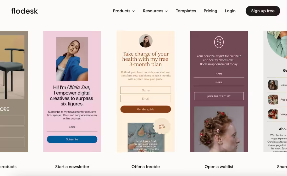
Flodesk Link In Bio
Flodesk Link In Bio allows you to create a single, extra-toight web page for you to use in your Instagram bio. Now I’ll give it to you Flodesk – these templates are total hotties. Way cuter than the market leader, LinkTree.
But again, as a website professional – I do not recommend using this product UNLESS you do not have your own website, or you have a website that doesn’t allow you to create your own pages.
The short version is that these tools take traffic away from your domain, which ain’t good for your search engine optimisation (SEO). The long version? 3 basic reasons why Linktree is still bad for SEO.
Flodesk Checkout
I’ve umm-ed and ah-ed a lil too much over this product. Flodesk Checkout allows its users to create one-off sales pages and accept payments. Again, I can totally see this being handy, but as that pesky website design professional that I keep being, I really want this sorta content to be on a website for a whole myriad of reasons – with the biggest being SEO.
I do think it could be handy for service businesses who maybe wanna sell one-off event tickets or digital downloads, but I think I’ll keep noodling on this for another day.
Now it’s time for the bad bits.
Cons: the Flodesk foibles that left me a lil grumbly
1. Weak onboarding and handholding
Flodesk’s simplified UI does a great job at pushing users towards the settings they’ll likely need, but gosh I would’ve appreciated a little checklist or video when I first opened the email builder.
This is a small gripe for me, but I can imagine the less-technologically comfortable users would call it a medium-sized gripe.
Over-all, Flodesk is definitely a platform that I believe anyone could feel confident and comfortable using, but a little extra hand-holding in the first 10 minutes could save all the griping, and gripe-free is always the goal.
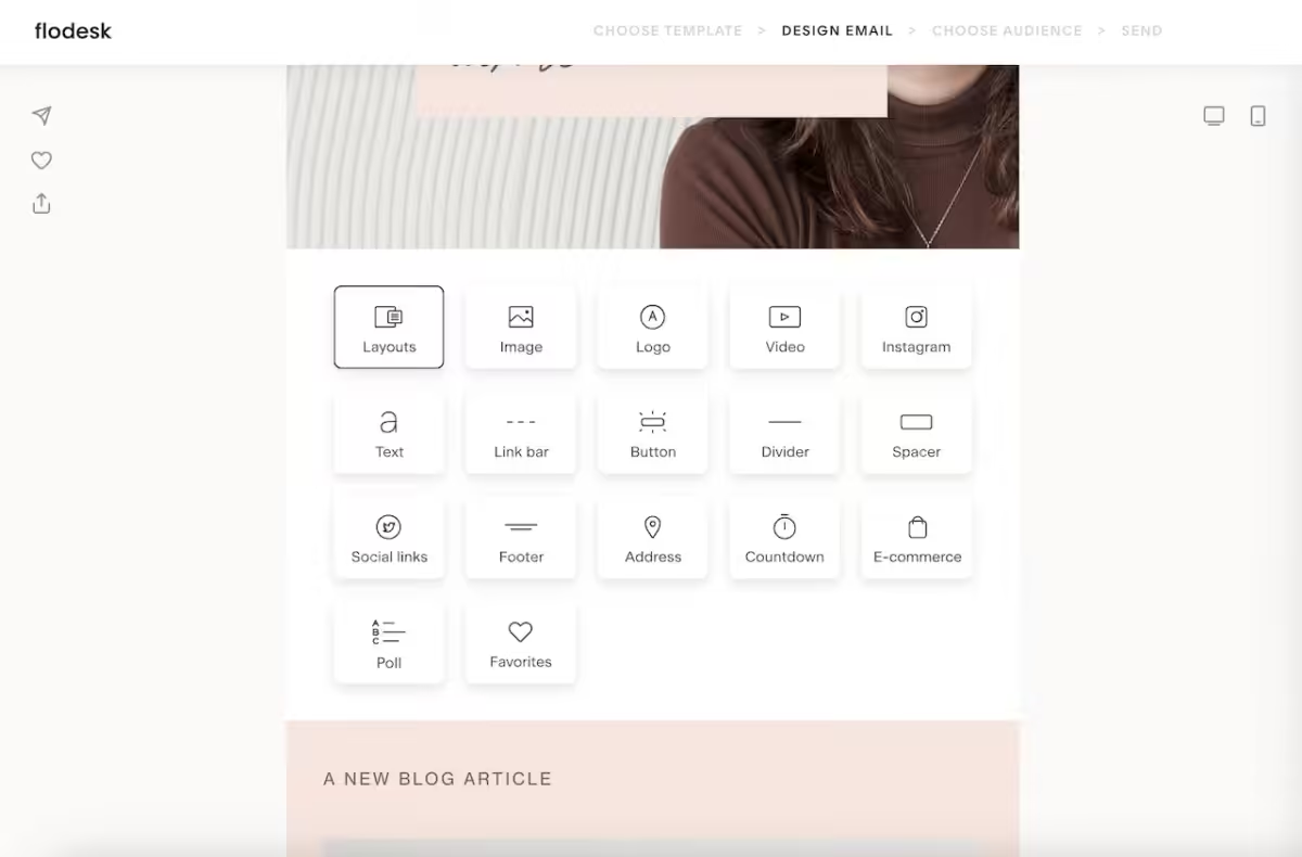
2. No explanations of template layouts vs blocks
My previous experience in email marketing meant I pretty quickly twigged where, why, and when I could use those magical layouts that included my custom brand fonts.
But, again I can imagine that for the average user, it’d be rather confusing as to why only certain types of building block allowed for full customisation.
Again, this is a really small foible that I think could be solved with a UI update (maybe separating these building blocks into fully customisable branding vs partially customisable) or a lil onboarding video.
3. Some of the UI is just way too subtle
I had to send a WhatsApp to my trusting Liz Mosley because I couldn’t work out how to send myself a test email.
And then I wandered off for a latte, and when I got back trusty Alex had logged in and sent tests to himself, me, and our client manager, Cai.
How did I miss the button to do this? Because it’s really freakin’ tiny, unlabelled, and in a tasteful muted grey that does not scream “TEST ME HERE!”.
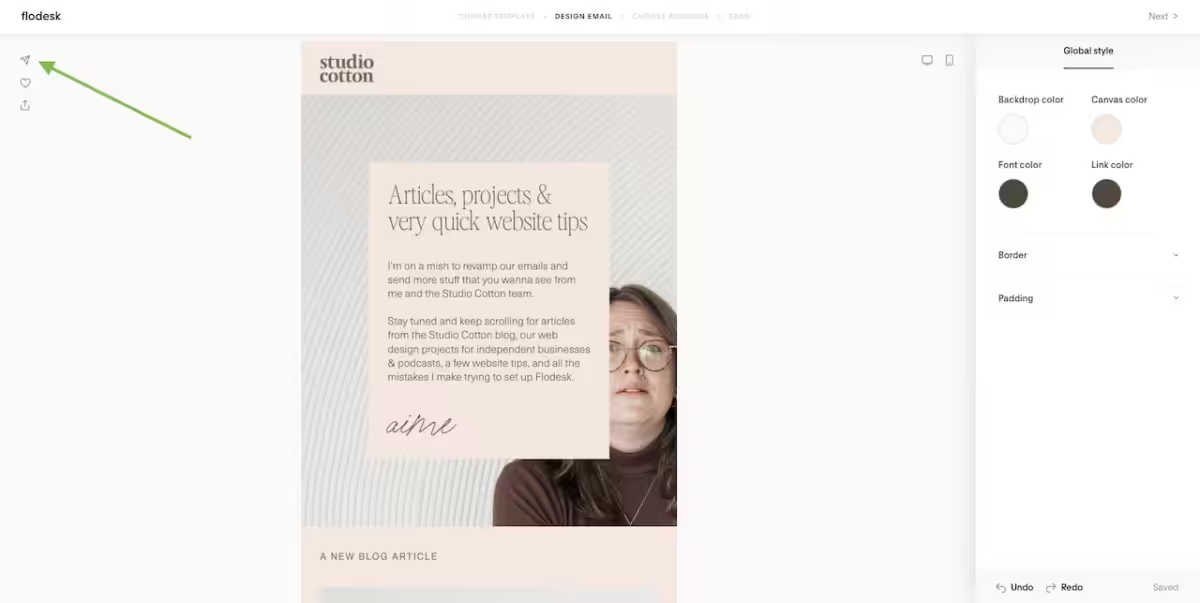
Whilst the simple and subtle UI is for sure a net positive, there are a few instances like this tiny send icon which could definitely benefit from additional user testing.
4. Padding and size sliders that I despise with every bone in my body
This is the only feature I full-on hate about Flodesk, and I have a feeling that other digital designers will be with me on this. There are many places in Flodesk where you need to set sizes for your email – font sizes, padding, buttons.
I’m a pixel-perfect kinda gal, so when I see an option to pop padding in a layout – I’m gonna click on that gorgeous lil box and type in a cheeky 30px. Maybe a 45px if I’m feeling fruity. Or maybe 15px if I wanna scoogy stuff up.
But Flodesk, you scalliest of wags won’t let me type in my pixels. And I’ll be honest, I full-on hated you a lil for this.
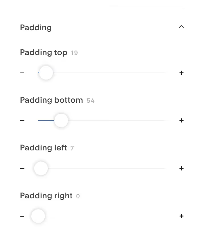
Instead, users are greeted by these draggable sliders. Infuriating. IN. FURY. ATING. Especially as the scale is so wide that I constantly found myself dragging the slider to kinda close to 15 or 30 or 45, and then having to nudge it the last couple pixels with the plus and minus buttons.
Flodesk. Seriously just let me type in my own numbers. I can see the numbers. Just let me click on them and type them in. Please.
However. Given this is my biggest source of Flodesk frustration, I’d say that’s a pretty big testament to how solid and user-friendly the rest of the email platform is.
5. Inconsistent editing/customising functionality
A small complaint about the layout templates. I tried to build my campaign from as few layouts as possible, and using layouts that were as similar as possible to each other. This is generally a good tip to maximise consistency, and also same some time in tweaking and editing styles.
However, on a couple of occasions I found layout blocks that seemingly looked the similar, but would have different customisation options – like the ability to add or edit padding in certain areas. This was a lil annoying and meant I wasted a bit too much time adding content to a section that I ultimately ended up binning.
6. Cannot create custom email templates
This is a biggie. Well, a medium-biggie. Flodesk does not allow you to create a custom template for your email campaigns. Instead, you can clone previous email campaigns – but I do not accept this as a longterm solution.
Every time an email is cloned and edited, it becomes a little different to the original source. Like a photocopy of a photocopy of a photocopy – it degrades over time as small changes accumulate, and can turn into something a bit messier than you want your customers to receive.
Degradation isn’t a huge risk if it’s generally the same person sending every email, but if you have a team, or a freelancer, or if you’re just a free-spirit, it can lead to inconsistency in no time.
Weirdly, Flodesk does say you can send a campaign to another account as a “template” – but it just arrives like a normal campaign.
7. Only one brand per account
Let’s say you’re a freelancer marketer, and you create email campaigns for 6 different brands. Well, sucks to be you because as far as I can see, Flodesk only allows for one Global Brand Styles.
Again, not an issue if you are only using Flodesk for your own business, but as this feature could directly impact a business like mine, I couldn’t leave it out.
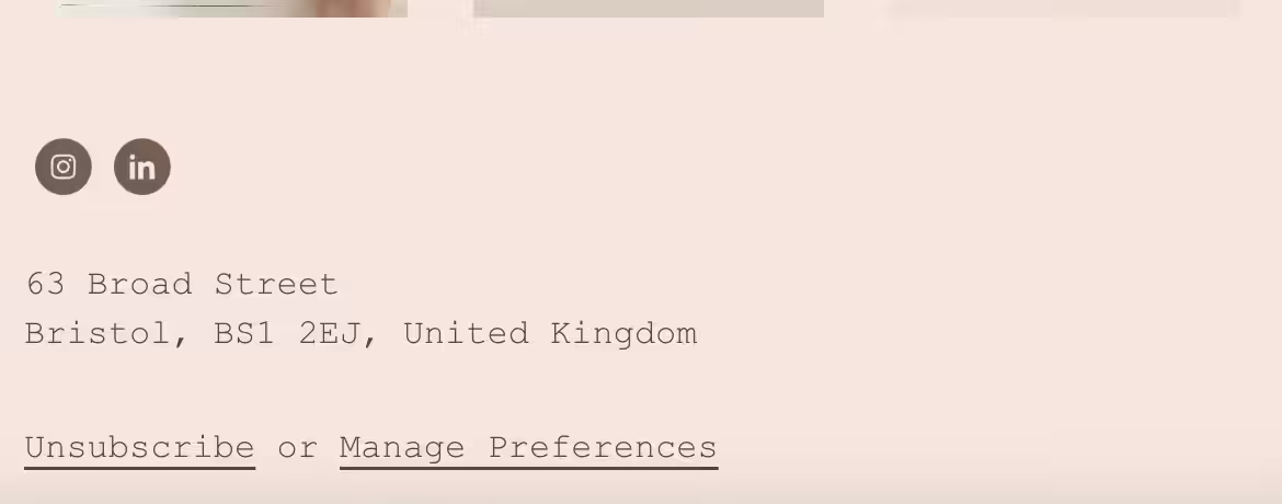
8. Disappointing email footer options
I’ll be honest, I probably ran out of steam by the time I got to our email footer. But. Given how gorgeous so many features of Flodesk’s emails are, I found their default footer rather, well, meh.
It’s fine, but given the rest of the email design options are so luscious, I expected a tiny bit more va va voom. Pizzazz. Je ne sais quoi.
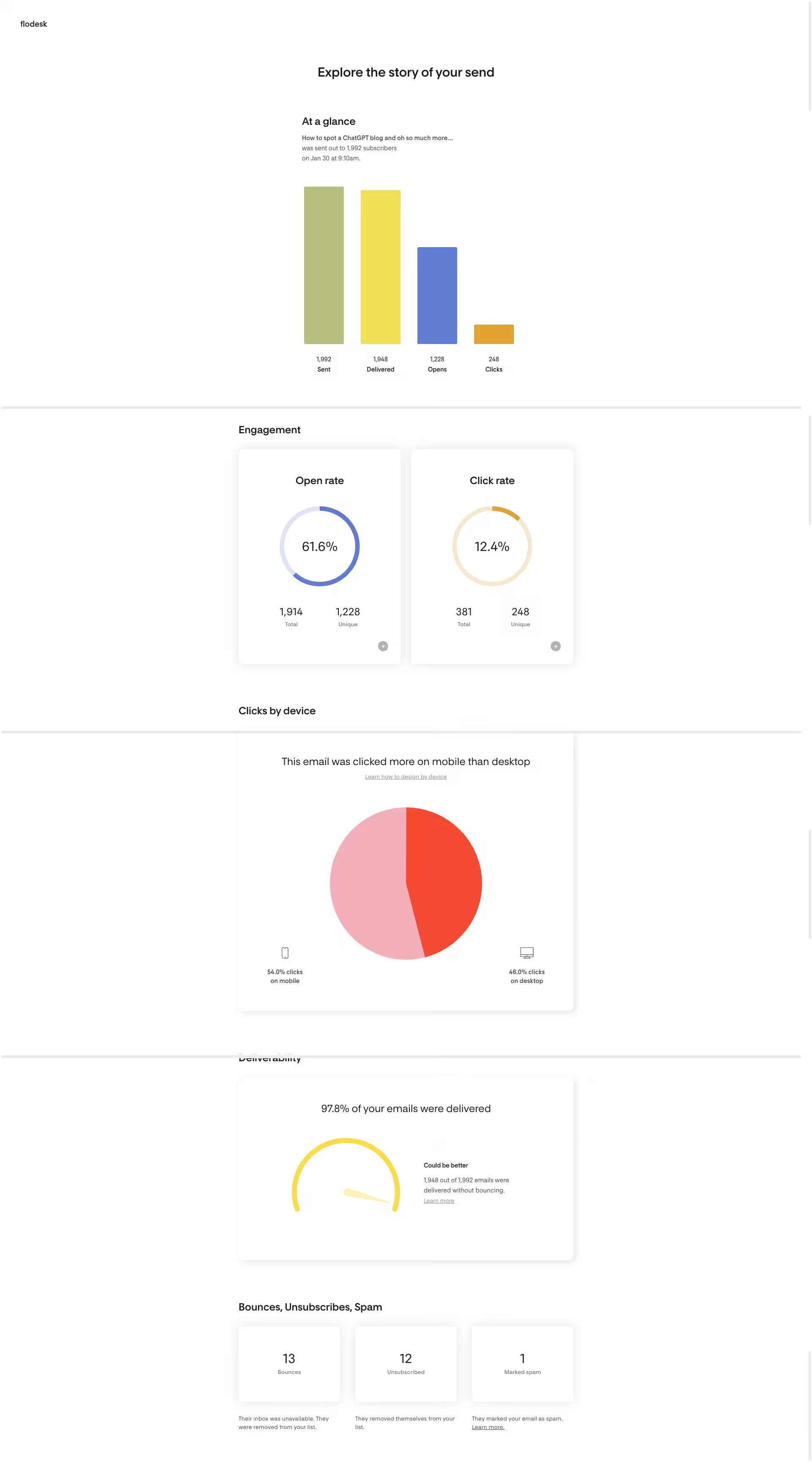
9. Single campaign analytics that are somehow both over- and under-designed
If I were the type of lady to write girly, I would say I’m a numbers girly. Stats really do it for me, and as a totes profesh businesswoman, I want to analyse my campaign performance to help me understand the content my customers wanna see from me, and what will convince them to buy.
There are only a few email campaign performance metrics I tend to spend time on, and Flodesk pretty much has those covered. However, the report itself is not the most intuitive, with foibles like the list of where users clicked only being available by clicking on a bar chart?!
What’s more, it makes up 4 whole screens-worth on my big monitor, or 6 on my lil MacBook. Spreading so few metrics over so much space makes it harder than it should be to get that quick birds-eye view of email performance.
10. No email click map
A click map shows you which buttons, pics and links were clicked on an email campaign, and it’s one of my favourite email analysis tools. But, Flodesk doesn’t have one. Boo hiss.
11. Only one user per Flodesk account
I never want you to share passwords. A password shared is a password weakened. I want you to share passwords even less when that password is protecting a buttload of personal data in your audience’s email addresses, and potentially their names too.
By only allowing for each Flodesk account to have a single login/user, it forces brands to share passwords when multiple people need to create, send and analyse emails. This is undesirable security 101.
It’s also a bit of a pain for companies like mine that need access to our clients’ email accounts to hook them up to their websites. MailChimp wins out here by a long run, with their Client Management, I could request and gain access to different accounts using our own credentials, saving the need to share passwords.
12. No non-native ecommerce
This alone is a total dealbreaker for online shops. Or at least, in my professional opinion. Flodesk does not allow for ecommerce information from your Shopify, Squarespace, WooCommerce or, well, any website platform to be passed into Flodesk.
This means no smart abandoned checkout emails, no segments based on spend, no purchase-based workflows. For me, these are non-negotiables for an ecommerce email partner, and definitely where MailChimp, Klaviyo and more could be more suitable picks.
So what’s the verdict on Flodesk
Yes. I like it. The benefits and features of Flodesk make it a great tool for service businesses like mine, as well as leisure & dining, content creators, podcasts and more. Its ability to create beautiful emails quickly is a HUGE win, and anything that gets more emails sent by more businesses is a tool I’m happy to put my name behind.
I barely touched on the price either, but the fact that it has so many benefits and is so affordable is just lovely. A bit of good news for small brands, especially if you use my good friend Liz’s affiliate link for that cheeky discount.
It’s not without foibles, some of which seem like issues I’d associate with an 18-month old product, not one that’s been growing for a few years now. That said, I didn’t find any of them to be serious deal breakers for most small businesses…
But not for online shops
Until Flodesk allows for ecommerce data to be shared from websites, I officially do not recommend Flodesk as a first-choice email platform for online shops. Of course, some emails are better than no emails – so if you really can’t get on with MailChimp, Klaviyo, or an ecommerce alternative, Flodesk might still be the right fit for you too.