Ah, it’s time for another instalment of my Website tips for… blog series, where I dive into the depths of my 8+ years of running a web design co to pull out some tips, tricks, tasks and website changes for all sorts of small business.
This time I’m sharing some easy-to-apply web design & optimisation tips for the business of blogging, and helping all you longform content creators to get more eyes on your words, and more fivers in your pockets too.
Blogging is ever-so-close to my own heart. It’s one of my favourite activities here at Studio Cotton, and there are certainly days where I wish my only job was writing these jam-packed, helpful, and mildly whimsical forays into the world of website advice.
Having a business blog that’s chocka with rich content is also our biggest audience-grower, and a big reason why we’ve been nearly constantly booked out for almost a decade too.
So let’s get into it.
PS. This article unintentionally turned into 2-parter, so if you wanna open the second half in a new tab for later, here’s the other 9 expert website tips for bloggers.
1. Seek web design inspiration from online news & magazines, not just other bloggers
One thing I love about working with independent and small business websites is seeing the micro-trends and practices that filter their way through different industries.
In the world of enterprise businesses, many decisions on design, layout, content and website architecture are made by experienced website experts, supported and verified with a ludicrous amount of self-testing and refinement.
Well, small businesses – including independent bloggers – very rarely have those experts on-hand, or the chonky budgets and technology needed for continual testing and web optimisation.
In my experience, this is why a lot more web design decisions are influenced by a business’ own community, as each brand looks to its peers and communities to see how everyone else does it.
Unfortunately this can lead to a lot of bad website practices petering through an entire industry as it’s copied and replicated over and over again – and the world of blogging is very much not immune to this.
And actually, this is one of the big reasons why I’m writing this article – because I wanna help people turn more blog websites into websites for the business of blogging.
But to get the the point AIME. A good trick to get small businesses and website DIYers to look outside their box is to start taking influence from the bigger brands that have the same sorta product.
As a blogger, your primary products are your articles. You wanna get more users, pageviews, and engagement, so you can turn those into collaborations, revenue, and clients.
I want you to look at other businesses that promote articles – the world of online magazines, news sites, and publications. One of my favourite websites for this is Grist.org, a climate & justice publication, but I also want to shout out popular options like Stylist, and timeless source of interior inspo, Architectural Digest.
2. Optimise the HECK out of your blog article body text
For an extra dash of transparency, I’m currently writing two new articles concurrently (see, told ya I loved blogging). The second piece is a very thorough how-to, where I’m going into all the depth on optimising website body text.
It started out as part of this blog post, but as you can tell, I am very wordy, so needed to split it out. Hopefully, after I finish the how-to, I’ll come back and post a link to it righttttttt here:
[Ok, I haven’t finished it yet]
Body text is just the words that make up the body of a piece of text. You’re reading some body text right now. Great work. It’s pretty much all the text in a paragraph format, and on a blog website, there’s an absolute buttload of it.
Like I mentioned previously, for a professional blog website, your articles are your products – and I like to think that the way you style and format your body text is like your packaging.
Let’s compare your latest blog article to some perfect prawn cocktail crisps.
If your crisps are packaged poorly in a packet made of flimsy tissue and laden with air holes, it doesn’t matter how good those prawn cocktail crisps are, because your customer can’t enjoy them. The unsuitable packaging ruins the contents.
Fluffin’ up the style of your website body copy can leave your blog words totally unreadable, and if your audience can’t read them, well that’s just a gosh-darn lot of writing time for no payoff.
Here’s some starting points on how to optimise body text that’ll be covered in way more detail in my other article:
- Ditch decorative and script font styles
- Keep it left-aligned, regular/lightweight, non-italic, sentence case
- Make sure there’s plenty of contrast between the text and background
- Minimum font size 16px (but I prefer 18px+) & 1.3-1.5em line height
3. Pop your primary topics in your main website menu
Ya know how when you head to most high street ecommerce websites, they have their primary product categories plus maybe a couple of seasonal options in their main menu?
Well this is because this website menu format comes with 3 main benefits:
- It is what users expect, and meeting the expectations of website visitors is generally considered good User Experience (UX), and increases a website’s conversion rate*.
- It reduces the number of interactions the average user needs to make to find the products/info that meet their needs, and fewer interactions usually means more time absorbing a site’s content.
- It keeps key terms on the screen at all times. A shopper can land on a blog, a product, a page and immediately see that a shop sells shoes or home decor or snacks or microphones.
*Conversion rate is the % of visitors who complete a website goal, for ecommerce that’s almost certainly a successful purchase. We’ll get into blog goals in a hot sec.
Replicating this ecommerce website mainstay can bring all these tangible benefits to your blog website too.
So rather than grouping all of your articles under one cramped ‘Read’ or ‘Blog’ link, try giving them space to breathe and make it way easier for your visitors to dive into more articles – not just the latest additions.
4. Homepage, article archives, article template: the big 3
And back to goals.
Every website has at least one goal; it’s the thing we’re trying to get our visitors to do, and the point at which we count a website session as a success.
For an online shop, that goal is a completed order at the checkout, and, for a service providing business like mine, the number one goal is a submitted enquiry form.
For blog websites, setting and measuring goals can be a little less obvious, but these are the most common we work to achieve at Studio Cotton:
- Engaging the audience with blog articles, so they turn from visitors into fans and followers
- Extending the visit duration and page views by encouraging users to stay on the site and read multiple articles
- Getting users to make a commitment to receive further info from the blogger – usually an email sign up, sometimes a social follow, ideally both!
If these sound like your goals too, you’re gonna wanna optimise the heck out of your home page, article archive template (the list of all your blog posts), and article template (the template that holds one of your blog posts, like this one right here).
These 3 templates will be seen by the highest quantity of users on the path to achieving your desired website goals – way more than your about page, your contact page, or even your media kit page.
Making sure these parts of your website are working as effectively as possible will make alllll the difference, and that’s why the rest of this article is gonna detail some wonderful tips to get them ship-shape and Bristol-fashion.
5. Merchandise your back catalogue on your blog homepage
“Aime, will you stop comparing a blog website to an ecommerce website?!”
Never!
Ya know how when you head to most high street ecommerce websites, they literally only showcase their newest products?
Yeah, they don’t. They’d sell way fewer products that way, and those silly geese wanna make mucho moola.
‘See the latest thing’ will always be a strong call to action, but it’s not always the best call to action, and certainly isn’t the only one either.
Imagine instead of being a blogger, you run a homeware brand and shipped in some epic cotton blankets at the end of Spring as you thought they’d be perfect for those sunset Summer BBQs.
Well, it’s now January and you still have a few epic blankets. Your customers also still want blankets, but this time it’s for snuggling on the sofa whilst they debate if Viper is the best Gladiator or just the worst. I vote best. Team Viper all day.
BUT.
Your homepage only promotes your new products, and your blankets are no longer new. This means that your new visitor, Sally, who has just moved into a new flat that’s a bit too chilly, won’t bump into them whilst she’s visiting your site to pick up a birthday present for her sister Jean.
Logically, we all know that if you had a big-ass banner or a product feed on your homepage saying something like, “Cosy up with an epic cotton blanket this Winter”, it would significantly increase the chances of selling blankets. It would help Sally find and buy the blankets.
On a blog website, sometimes that article you published 8 weeks ago or 17 months ago is the epic cotton blanket that your Sally wants, but isn’t necessarily already looking for.
That’s why I want you to merchandise your blog homepage like an online shop – sure, we want the new in, but we also wanna bring the articles that match the season, or a trend, or just something you think more people will love.
Use article feeds and banners just like an ecommerce website uses product feeds and banners.
6. Add some kind of blog article sorting & filtering
Will this be the last time I compare your blog website to an online shop? Probably not.
This blog website tip is for your article archive template, which I’m going to compare to the product archive template you’d find on every online shop.
Now you can just give your reader one long-ass page of all your articles from newest to oldest, but what if the article that’ll turn your latest website visitor into a blogging superfan is on page 7 of 13? Chances are, they won’t find it, and you’ll lose their attention, engagement, and your reach.
Just like with merchandising your home page, your article archive template is a great place to build in shortcuts that help your reader reach the content they want.
Filters, links and sorting in an article sidebar or topbar are a great, easy addition that don’t need to be over-thought or over-complicated.
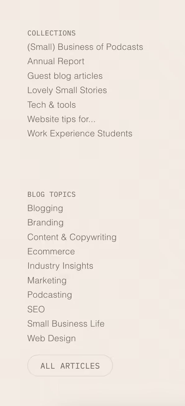
You can see on our Studio Cotton website that I’ve only got a couple of options for turning a blog long-list into an individual reader’s shortlist.
Giving helpful links that narrow down your blog archive will reduce the clicks and the friction needed for your audience to engage, and get them closer to your website goal.
7. Make sure your reading column is no more than 700px
Squarespace, I’m coming for you. And some Shopify themes. And quite a few WordPress templates. I would mention Wix but I avoid that platform wherever possible.
Ok, apparently I just have beef with a lot of websites and their non-optimal blog article templates.
The reading column on a web page is the width of a text area containing the words the visitor is reading. Ok, that’s a chewy explanation, but this reading column you’re on right now is about 680 pixels wide on a laptop/desktop, and on the first line of this section, it starts with Squarespace and ends with WordPress.
If the reading column is too wide, it significantly decreases readability as our pesky human eyes are not made to scan that wide, and our pesky human brains also struggle to find the start of the correct new line after finishing the one before it.
This is why newspapers print in narrow columns, and I’m guess it’s why books are portrait and not landscape.
This is where Squarespace is at its peskiest, because it’s incredibly common for blog articles on a Squarespace site to stretch across the whole screen. This. Destroys. Readability.
Make sure to restrict your blog reading column to around 700px max (around 12-20 words), even if that means jamming in a pesky spacer block.
8. Make sure your subheadings are appropriate, specific H2s
Website headings have a semantic meaning, which just means that have a literal correct way they should be used, and any other way is straight-up wrong.
A website will usually have 3-6 heading levels available – Heading 1/H1, Heading 2/H2, Heading 3/H3, yadda yadda yadda. In most website builders, you can change the heading level of some text by highlighting it in your editor, and selecting the heading level of your dreams.
Headings are hierarchical (another one of my favourite words), which kinda means that H1s are the most important, followed by H2s, followed by H3s, yadda yadda again. All headings are more ‘important’ than body text.
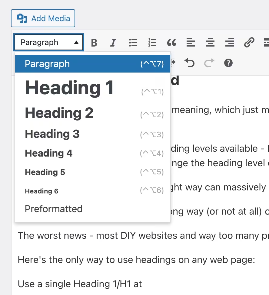
The good news – using them the right way can massively boost an article’s search engine optimisation (SEO).
The bad news – using them the wrong way (or not at all) can fluff up your SEO.
The worst news – most DIY websites and way too many professionally-made websites use them the wrong way.
Here’s the only way to use headings on any web page:
- Use a single Heading 1/H1 at the top of a piece of content: this is the title of the page, product or blog article
- Break up that piece of content into clear individual sections, starting each one with an H2 subheading
- If you need to break up one of those sections into subsections, use an H3 sub-subheading
- If you need to break up a subsection into sub-sub-subsections, well, you get it
When blogging, you’ll probably include about 3-10 H2s. If you’re writing a listicle like this one right here, it could be as many as 20 – or even 41 in my listicle of listicle ideas.
Google heavily relies on H2 headings to understand your blog content, and the more it understands, the better it can match your article to Google searches. They’re kinda like signposts, or, well, headings in an academic textbook.
Because those H2s are more important than your body text, it’s crucial to make them specific, helpful, literal and relevant.
A blog article without H2s lacks those signposts, and an article with willy-nilly headings can sign post all the wrong things and land you in a proper SEO pickle.
“Bolding text surely does the same thing as headings right?” No. Wrong. Bolding text does nothing. NOTHING. Well, it makes it bold.
9. Tables of contents and how to use them
“Adding a table of contents boosts your SEO!” – anyone else hear this viral nugget of SEO advice in 2024?
So. It’s not all total fairy-guff.
First off, a table of contents (ToC) sits at the top of an article, giving the reader a few links to jump through to a section of the article that sounds like it might meet their need. Just like a ToC in a text book or manual.
A ToC does impact how a web page ranks as, in some situations, ToC links literally appear alongside a page’s title within a search result. The fact that the links are there is a literal impact, just not necessarily a significantly positive impact.
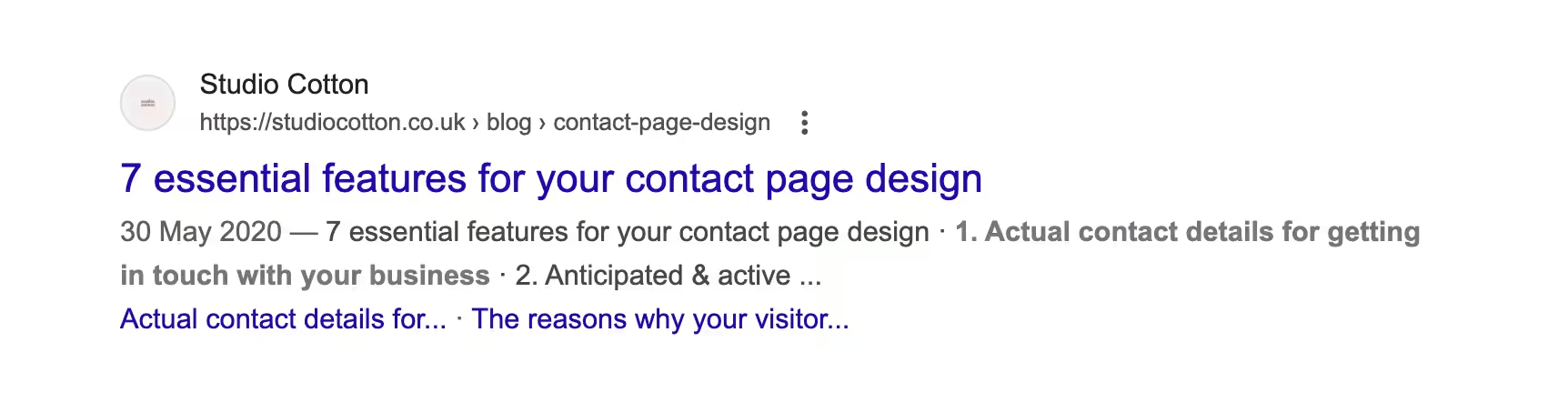
We generate our articles’ ToCs using a configured widget in Elementor, one of the technologies we use to create our websites. This building block picks up on all the H2 headings in our article, and generates a clickable, collapsable list.
Because of this set-up, adding a ToC takes my team and I precisely zero additional minutes every time we publish an article.
Now back to that myth. I saw “ToC = better SEO” spread around like widlfire last year within the blogging community. So let’s start with some actual stats…
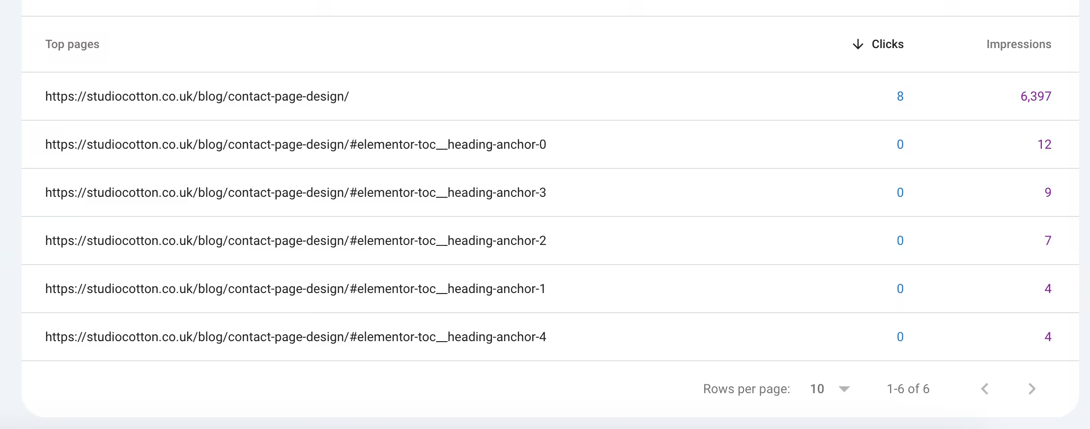
Those gobbledygook links are the ones Elementor made in our ToC, and you can see that whilst the article itself gained nearly 6,400 impressions from the main link, the ToC links got 36, and zero clicks.
Now, that’s just anecdotal, and as someone with a particularly useless degree in Applied Genetics, I hate anecdotal evidence. But. It is somewhat indicative that a ToC is unlikely to be the key to one blogger’s SEO success.
So how do I explain the uptick in views for bloggers who did implement ToCs and saw a lil traffic boost?
H2s, baby. Every automated ToC will pick up H2 headings, which I think forced a lot of bloggers to finally adopt this correct and traffic-winning practice into their blogging.
I’m going to pause here. Ya know I tried so hard to write a succinct article – especially after a previous foray into the Website Tips For… series ended in a 5,000-word two-parter for cafes and coffee shops.
But alas, I am one chatty-as-heck Cathy.
I wanna get something up on our website, so I’m going to publish this chocka article on website tips for bloggers. Check back later for a part 2, where we’ll cover more SEO and web design tips, plus a whole heap of actions around monetisation.
Ok, it’s later now! Here’s part two with all those extra website tips for bloggers.