Ah, the clearance sale. An event that no shopkeeper really looks forward to, but somehow also feels quite cathartic and exciting, and maybe a little freeing too?
A clearance sale is a necessary if awkward activity – a chance to shift that stock you overbought, or the products that didn’t land with your customers like they did with you, or just a chance to say goodbye to whatever has been clogging up your stock cupboard/room/drawer/pile.
Now, here’s the very good news: customers love clearance sales. They love getting a bargain, especially from their favourite independent shop or maker.
It’s why “Sale now on” and “Save XX%” emails have some of the highest open & click rates, and why launching a sale sometimes feels like the only time Instagram actually lets you reach your followers.
So, really, you shouldn’t have to change too much on your business’ website to shift that clearance sale stock. But.
Once that stock is on your website, I want it gone as soon as ruddy possible – and I’m sure you do too.
Not only to free up your precious storage space and pack up your sale ribbons, but to avoid a lingering sale department devaluing the rest of your inventory.
See – a clearance sale is such a strong call to action that it might just take away attention, clicks and sales from the rest of your online shop.
If you want your big clearance sale to be a quick clearance sale, I got you. I’ve been creating websites for independent shops and small businesses for just about a decade, so here are my 9 website design tips for selling more clearance & sale stock.
1. Embrace a little Sale Red
I’m all for brand consistency – but I’m also all for using every available tool and technique that helps small businesses to sell more and thrive, so that I can buy more nice things from nice people.
Which means that, even if your brand palette doesn’t have anything close to that classic primary red, I still think you might wanna try it.
I’m no colour psychologist or human behaviourist or data scientist or red-ologist, but I have consumed a truckload of articles and stats from these kinda people* that repeatedly say red is the colour of urgency, of action, of attention – and it can make customers act.
What’s more, if you picture a big red banner at the top of a website – what do you imagine it saying? Sale, right?
The colour red is such a ubiquitous clearance sale indicator, that just its presence on your website could draw those customers and clicks.
If you’re looking for some red-spiration, here are a few hex codes I’ve curated for your next website clearance sale…
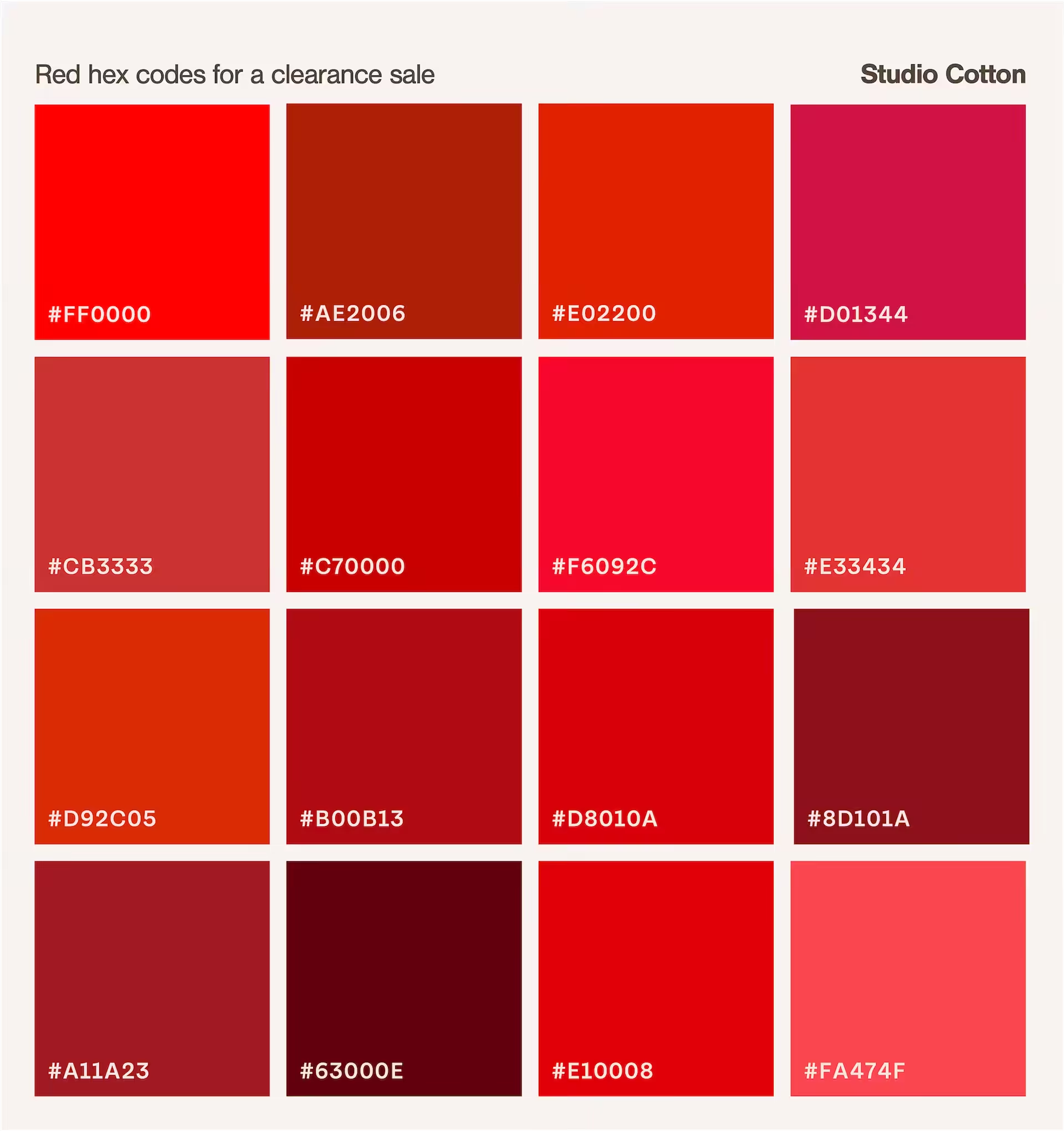
*ok, I totes made up red-ologists to hopefully earn a small chortle, wry smile, or cheerful exhale from ya.
2. Add a sale link to the beginning or end of your main website menu
Your website menu is one of the few areas on your website that every single gosh-darn visitor is likely to encounter – so it makes total sense to use this navigation feature to shove customers towards your clearance sale.
We can also take that metaphorical shoving up another notch by popping the sale link in one of the two most prominent menu positions.
The first link on the left of your menu (where you’d usually find new in) is the most likely to be clicked, so a great option for your clearance sale when you want to maximise the eyes on your discounted prizes.
My go-to position though is the last link on the right. This spot is where a lot of visitors expect to find a sale link, and when it comes to website user experience, meeting the expectations of our users is almost always the best option for getting products in baskets.
Oh, and if you wanna get even shove-ier? Let’s turn it Sale Red too.
3. Create sale subcategories
Reduce the number of clicks between your customer and the clearance sale products they love by adding in sale subcategories. Think Sale tops, Sale lighting, Sale under £15, Footwear up to 25% off, or any of these 32 sale subcategory links from the Oliver Bonas mega menu…
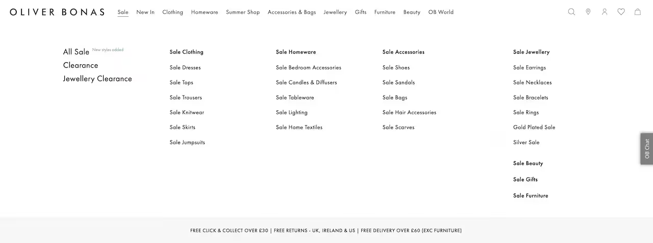
And if that’s not enough clearance sale subcategories for you, check out department store legends John Lewis with a cracking 49 different sale links in their mega menu.
I mean, that’s so many sale links that I’m almost certain I’ve counted wrong.
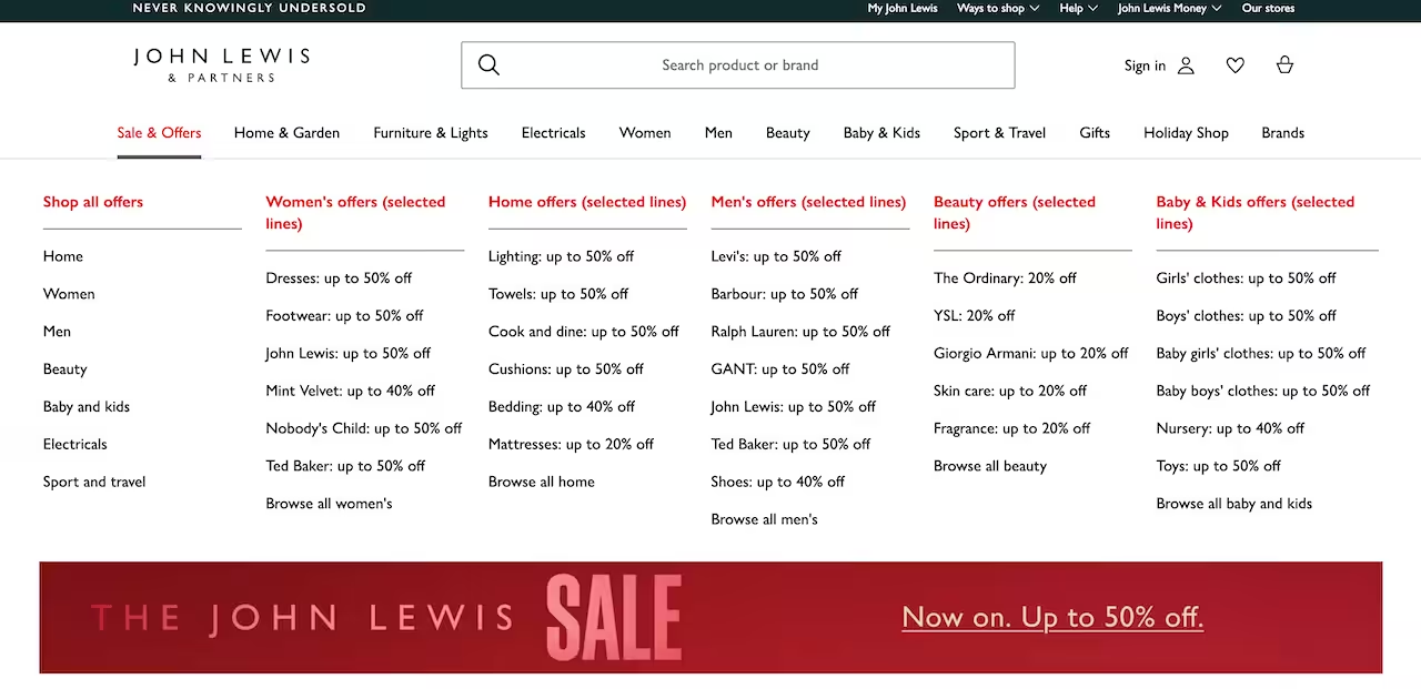
Not only do these clearance sale subcategories reduce the potential clicks between your customer and their next purchase, it also provides information and inspiration.
Like, I might have been visiting the John Lewis website, say, to see if that Samsung TV with the cool blue bezel was on sale – but on opening this, I spot:
- The Ordinary is also 20% off, and I didn’t even know they were stocked at John Lewis, which is great because I need to buy cleanser to top up my gym shower supplies
- They have 50% off footwear, and I’m pretty sure they sell Clarks, so I wonder if they have those daisy-print Wallabees I’ve wanted for ages
- Ya know, whilst I’m here, I will quickly take a look at dresses, as 50% off is just a great deal
Subcategorisation is a classic big-business and high street giant website design choice for selling more – and get this: it could also massively boost your search engine optimisation (SEO) too.
Each clearance sale subcategory/collection creates its own page on your website – a page that has the potential to appear in Google search results.
So if you pop all of your over-purchased Scandi homewares into a collection called “Sale: Scandi home”, well, you now have a way way way way way higher chance of appearing in the results of all those bargain-searching Google searchers.
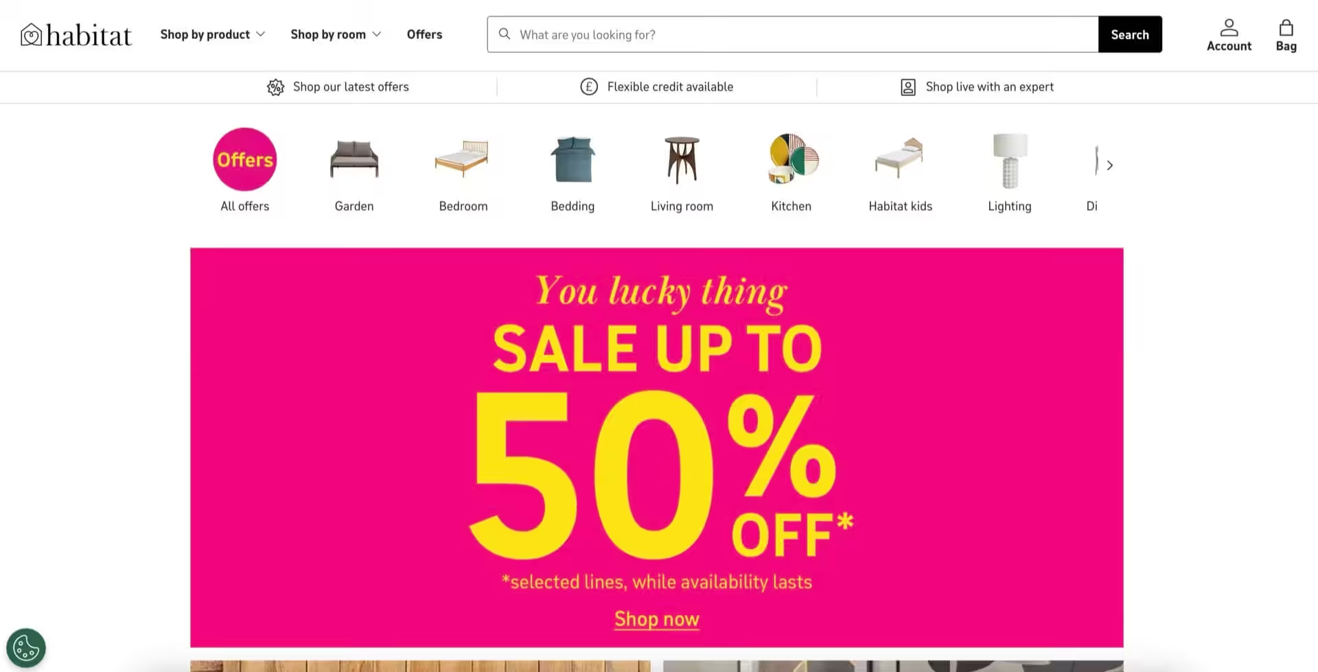
4. If you have products with a big percentage discount, use that in your sale headline
Time for another imagination exercise. Let’s pretend you’re stood on a local high street and in front of you are two shops that are both equally appealing (and practically perfect) in every way – however, you can only visit one.
Like maybe you need to catch a train, or maybe if you visit both then they’ll turn into lava.
Anyway. In the window of Lefty Shop is a big sign that says “Sale”. In the window of Righty Shop, a big sign that says “Up to 60% off”.
Which would you choose for your lava-free visit? Righty.
Leading with a big discount emphasises your bargains with a highly seductive call to action – but it also sets expectations.
Lefty’s clearance sale could be 50% off, but it also could be 25% off, or 10% off, or I guess even 3% off.
You’ll see wording like “Up to 30% off hundreds of lines” on high street shops for these exact reasons – seduction and setting expectations. The most extreme version I found for this article came from former giants, Debenhams…
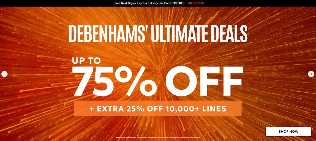
For your next clearance sale, look for the biggest common discount you are offering – we want that 30/40/50/60%+ discount – and thwack it into your headline.
5. Pop your clearance sale into your website’s top/announcement bar
A website’s top bar sits just above the main menu and logo. It usually has it’s own background colour, and houses links to pages and features that are important but don’t take a customer closer to a product or the checkout.
Stuff like order tracking, store finders, accounts, about.
I love a top bar for this ability to keep your main menu more focused.
Unfortunately, if you run your website on Squarespace, you probably only have a similar feature – the announcement bar – which has the annoying quality of allowing your customer to close it.
This top bar can be another ever-present website feature. Like your main menu, it’s a space on your website that most visitors will encounter – which makes it a great place for adding in your sale headline. Here are a few more I’ve collected from British shopping titans…

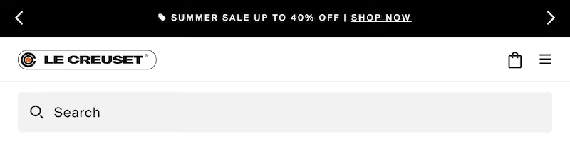



Also, I’m so glad I thought of writing this article as most online shops seem to be mid-sale, as it’s made finding examples so gosh darn easy.
6. Try a typographic hero clearance sale banner on your homepage
How many times have you added a clearance sale to your website, and thought “oh dang, I don’t have a pic of my sale products for my homepage”?
You might have even ditched the banner altogether due to a lack of appropriate photo – which means no hero sale presence on what’s probably the most-visited page on your website :O
Well, here’s where I might just blow your gosh darn mind.
Hero clearance sale banners that actually include photos and product shots are actually pretty rare these days.
You what-the-what?!
Big brands have that exact same sale photography challenge. Getting a photo of just items that are in stock and on sale is really tricky when stock is moving quickly, and you have no real way to pre-plan what won’t sell.
Enter the typographic banner.
Which is basically just a fancier way of saying a banner with a plain-ish background and words on it. Here’s even more high street examples…
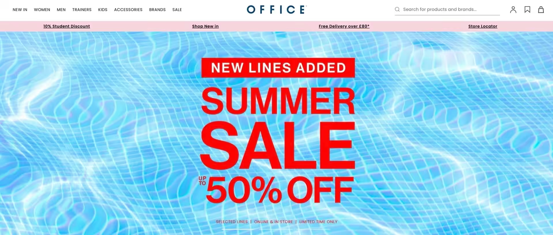
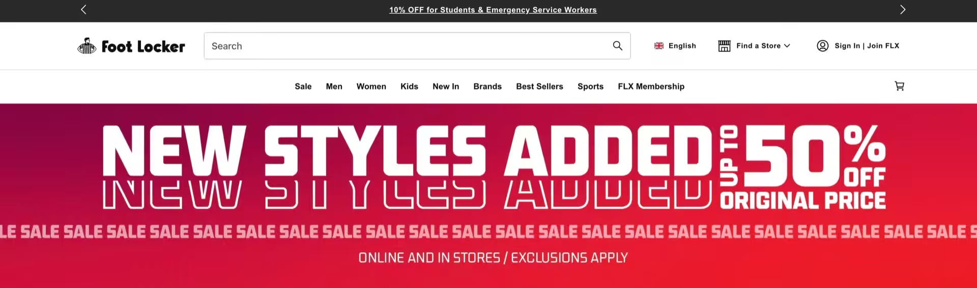
I wanted to bring extra attention to this clearance sale hero banner from & Other Stories as it’s classy, eye catching, and marvellously on-brand.
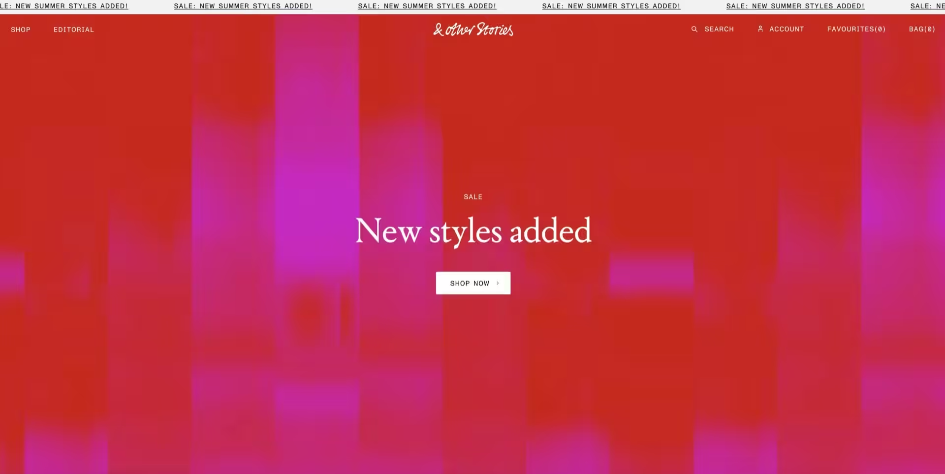
To recreate this yourself, just stick to a solid or gradient background on your hero banner. Feeling fancier? Create an abstract textured background in your favourite image editor, or even grab a free stock photo from libraries like my favourites, Pexels and Unsplash.
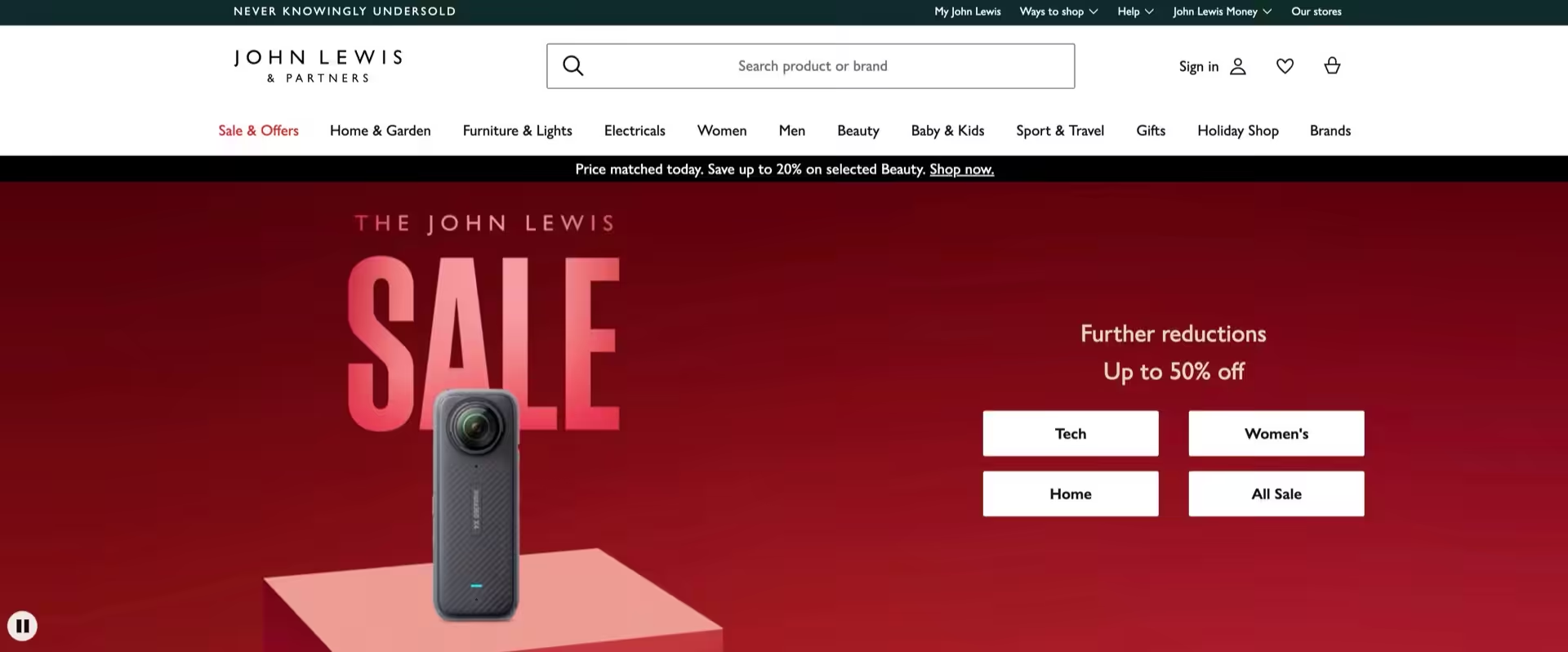
7. Add multiple sale buttons to your hero banner
Let’s take more advantage of your clearance sale subcategories with multiple hero banner buttons.
Ok, as a heads up – if you’re on Shopify I have a feeling doing this is a bit of a nightmare, so it might be one to skip.
Adding multiple buttons to your hero banner is another method for getting your visitors just a little closer to the products that best suit their needs, so let’s head straight to that classic high street example with my regular pick, John Lewis…
8. Filter your product feeds to only include clearance sale products
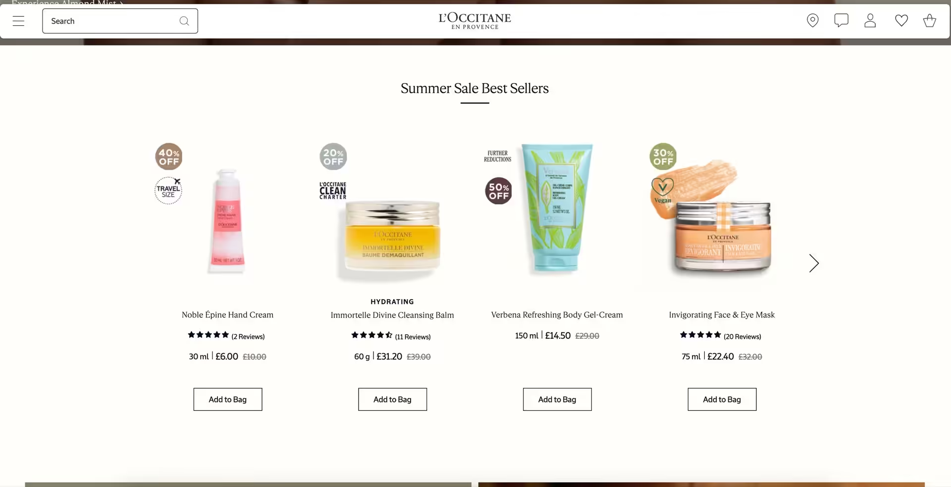
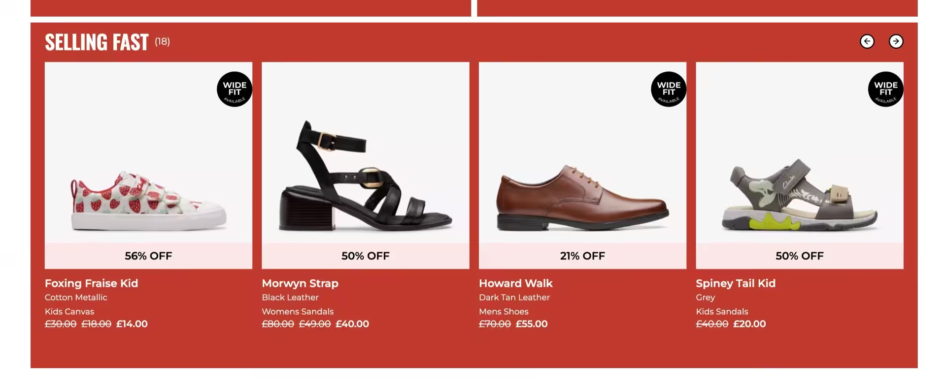
Staying on your homepage for just a little longer – let’s talk product feeds. You probably have a feed or two of products already on your home page, and I’m gonna bet that at least one of them is either New in or Bestsellers.
Now, how to make these feeds work so much harder for your online shop is a topic for another day (wait, actually check out this Instagram post for a preview) – for now, I want you to make at least one of these product feeds about your sale products only.
After all, who says you can only mention a sale once on your homepage?
In fact, if you’re running a massive clearance sale – or want to apply these tips to Black Friday – you might even want to make every single flippin’ pixel on your homepage sale-themed.
Again, this is a great use of your sale subcategories – but if in doubt, New in Sale and Sale Bestsellers will do just fine. And as this is the penultimate tip in today’s blog, I can’t end without another highstreet example, so here’s a tickle of L’Occitane and local legends, Clarks.
9. Pop sale badges or ribbons onto your product cards
Ya know in ye olden days you’d walk into a shop and see those neon star cards on various displays to indicate a great bargain? I miss those stars. If I ever fulfil my dream of openeing a cool shop, I am 100% gonna get my own star cards made in cute pastels.
Anyway.
I want you to add those stars – but digitally.
Product cards are the repeating design you’ll find in the aforementioned product feeds, but also on your archive pages.
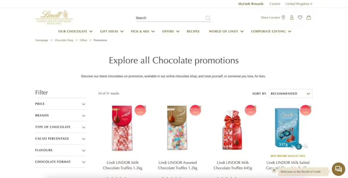
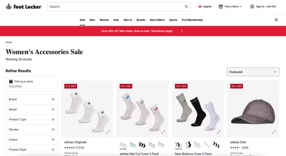
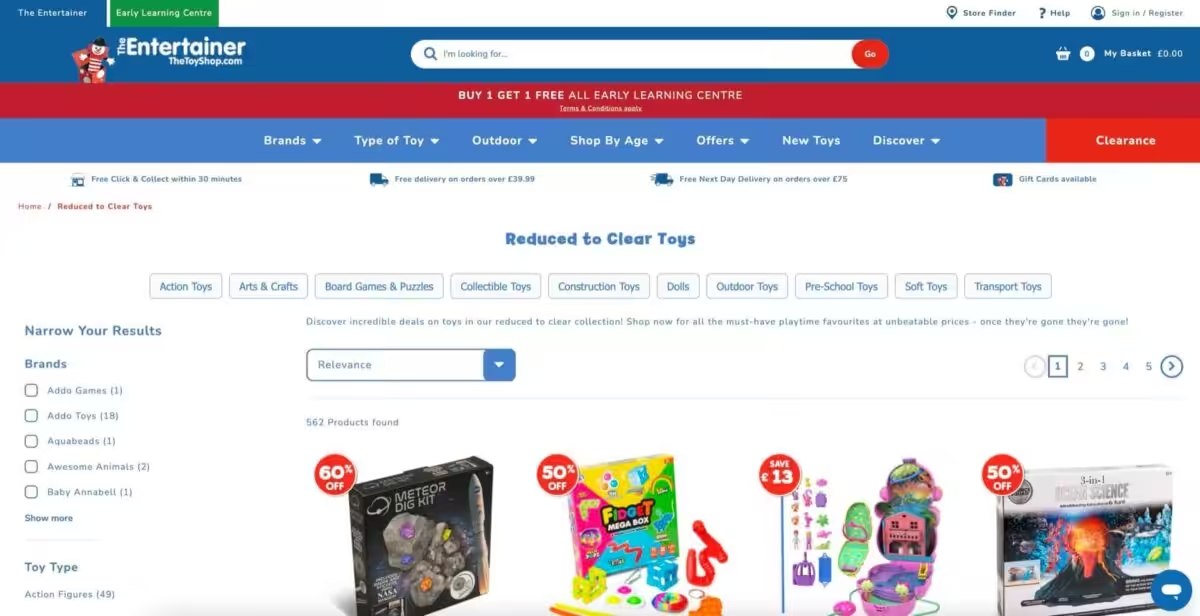
If you wanna have the sale-iest possible sale, add a nice red sale tag to the top corner of each product photo, or a ribbon that sits just above or below the photo.
You can scroll up and spot examples of this that I’ve already featured, but here are a couple extras just in case.
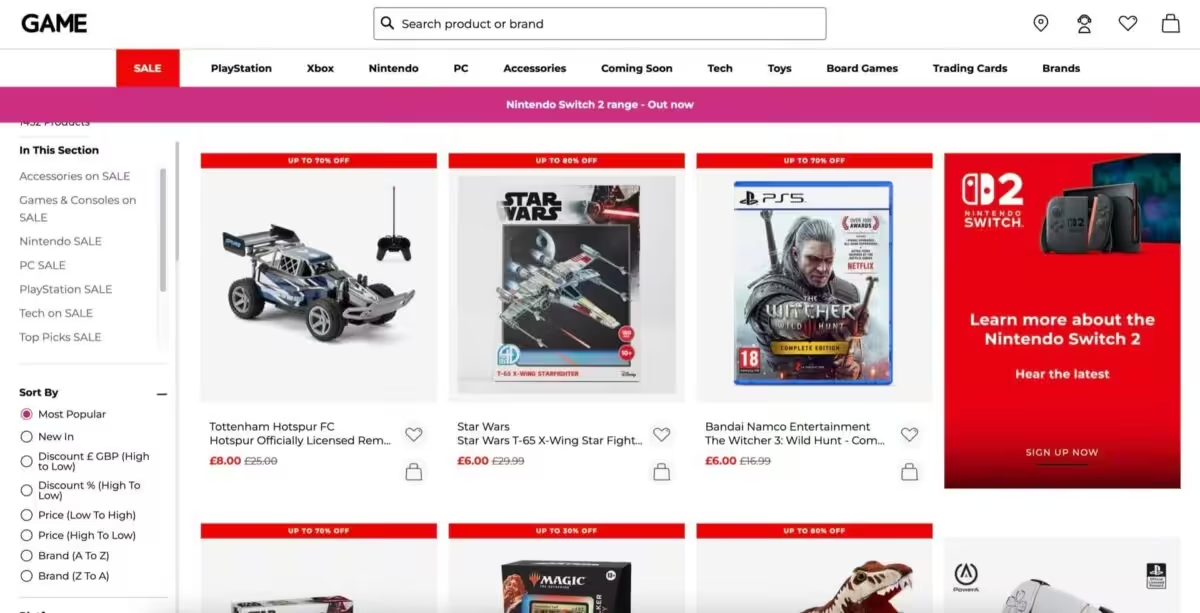
And those are my 9 website design tips for selling more clearance sale stock.
One thing that I thought was pretty darn cool whilst writing this article was that I never set out to use so many examples from giant ecommerce websites and well-known shops.
These brands have likely spent literally millions on optimising their website conversion rates – which basically means they make these web design choices because their stats say that doing this makes them more money.
Well – I want you to have more money too. So let’s learn from global brands and push our websites harder to shift sale products quicker and more plentifully.
Now I’d love to know your thoughts. Let me know what website design tip I’ve missed for selling more clearance sale stock with a cheeky DM via @studio.cotton on Instagram. There you’ll also find me sharing a heap of bitesize website and small business advice.
If you’re feeling more reading, I’ve got more blogs too. Check out all the articles from me and the Studio Cotton team on the topic of ecommerce, or dive into my Website tips for… series where I share expertise for specific industries and products, like website design tips for jewellery brands and website design tips for illustrators.
And finally, I wanted to end with a shoutout to Catherine Erdly and Resilient Retail – a client and regular collaborator. When I was researching other articles on optimising a website for clearance sales (to make sure I wasn’t covering a topic that’s already mega saturated), the only helpful content I found in my Google search results was from Catherine, so here’s an article and a podcast episode that you might want to dive into next, too: